Style
Collection Conversation with Eki & Richard: People Are Working | Part2
BN Style presents Collection Conversations, a weekly round up of all the collections and look books from African designers featured on BN Style from the previous week. Collection Conversations features Eki Ogunbor & Richard Akuson sharing their individual thoughts on featured collections from the previous week.
***
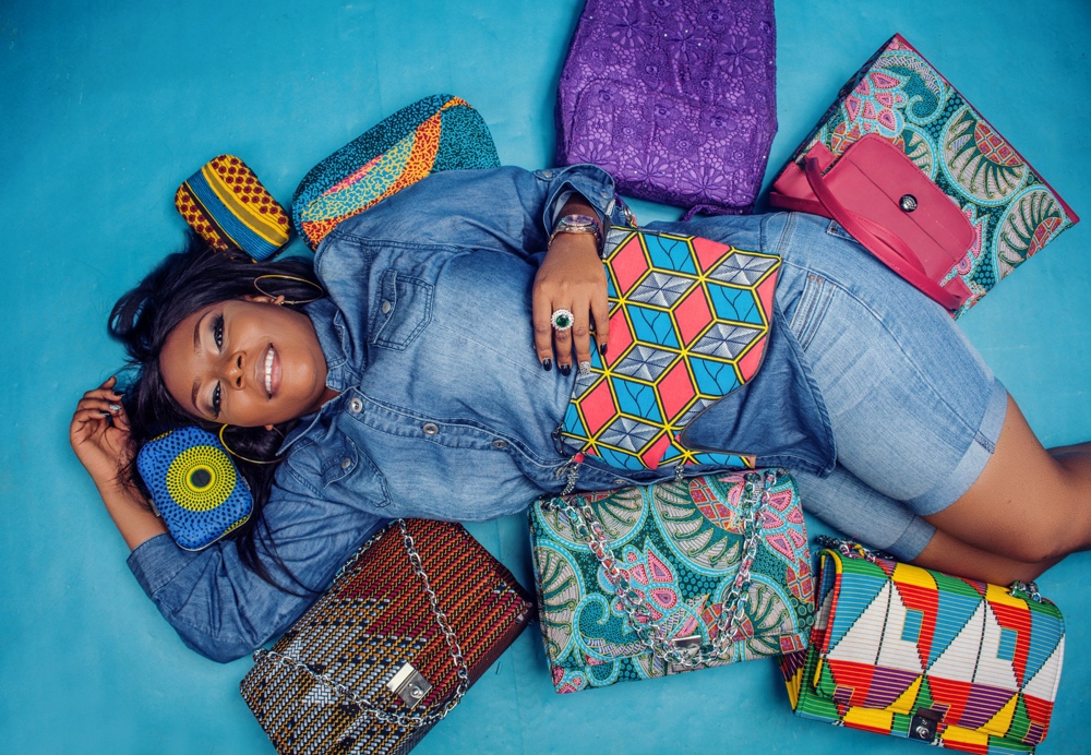
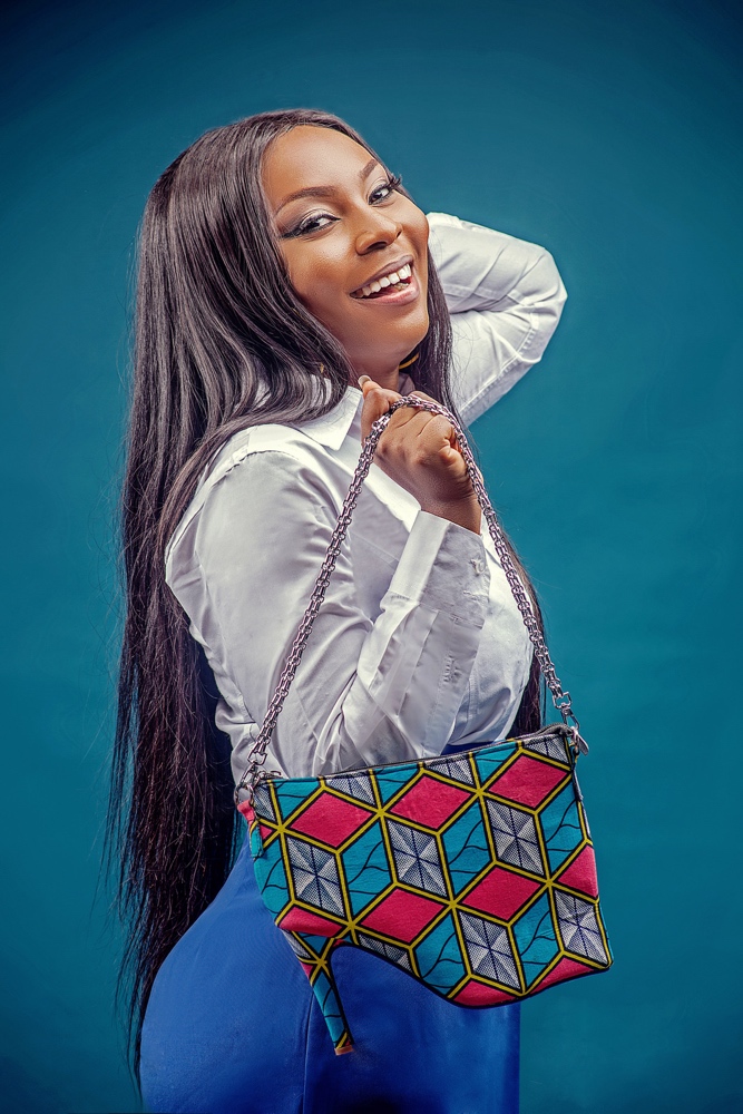
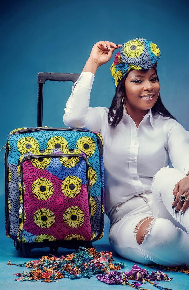
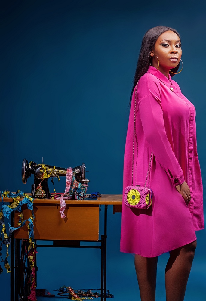
Eki: Hesey Designs next, the accessories brand
Richard: Not my kind of stuff. Don’t get me wrong, I like the exuberance of their choice of prints. But don’t like the finishing and execution of their work or products. Looks amateurish but I do like that string clutch, but even the clutch, just like the rest of their designs have been over done. Worst of all, the bag literally done in the shape of a stiletto is a really bad idea
Eki: Dang! Richard you really went in on them o! I agree that ankara bags have been over done at this point and they need to look for more things I think thats why they tried the hand luggage style which I havent seen yet, don’t know if you have but I haven’t. And yes the shoe clutch isn’t my style either but someone out there might like it, you never know. My fave is definitely the pink clutch
Richard: Hesey isn’t my cup of tea. Next?
Eki: Fratres
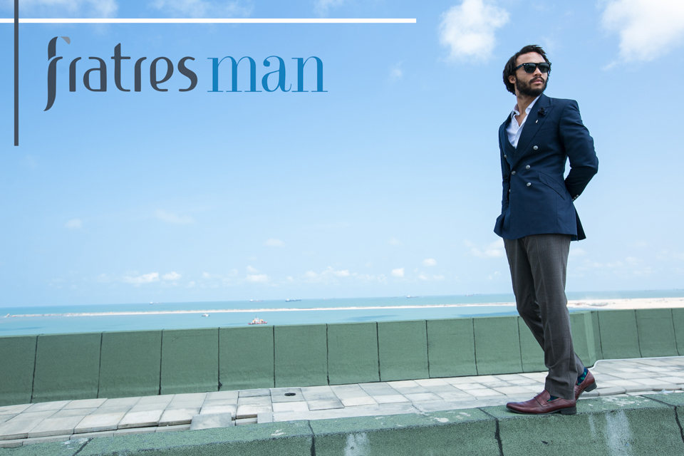
Richard: Nothing spectacular about the designs, just the same suits as we’ve always known them. Beautiful campaign though
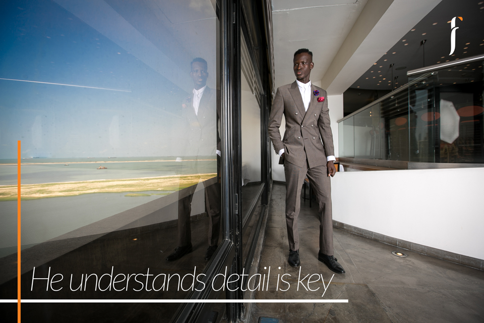
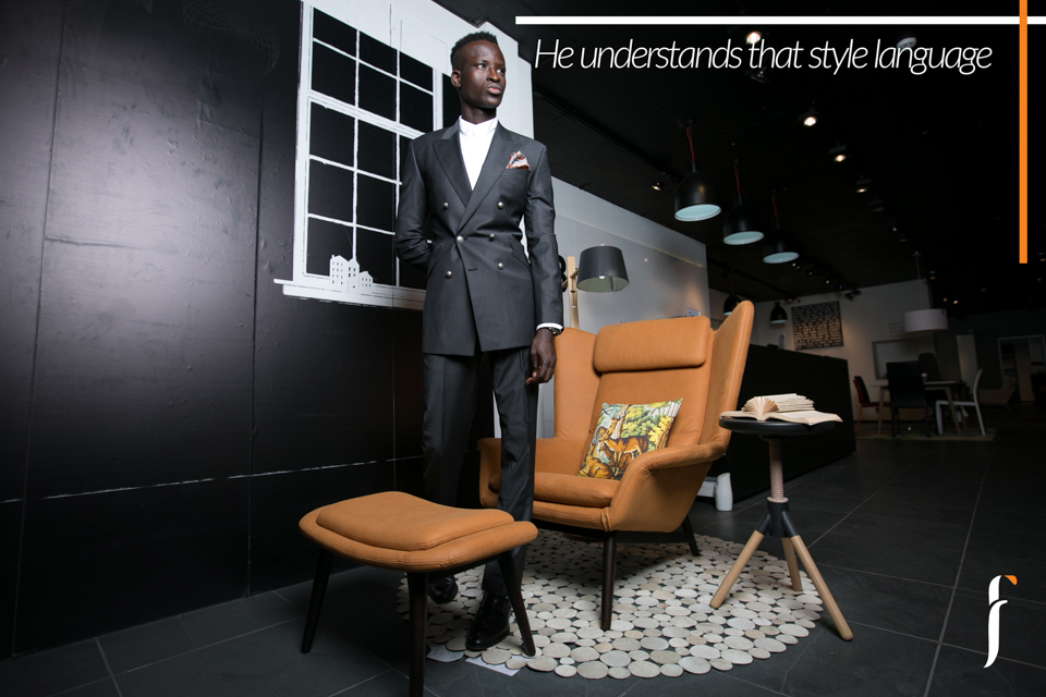
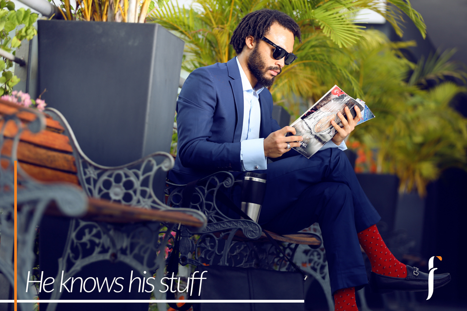
Eki: Yes great styling and I like the models used
Richard: And somehow, I found my self looking at the surroundings than the clothes
Eki: Yes I loved that as well but I think it worked well for the Fratres man “contemporary gentleman and his desire to look good while ascending the ladder of success” like they mentioned.
That being said I don’t have a favourite outfit but I do have a favourite picture and it’s this one above because of the surroundings like you said but with me (instead of the model) in a vibrant maxi dress ?
I think if they tried using contrasting colours with the background it would have worked better, this blue suits is too blue for the blue background.
This grey suit is too grey for the grey floor and white walls
Same with this. The clothes blend too much, It’s only the chair that’s standing out when it should be the suit
Richard: Hahahah. Yes, I see that. I clearly see your point and agree with you. Hopefully they take note for next time.
My favourite picture
Eki: Yes I like that one too. The clothes look very well made which helps a lot and I like the contrast of the very dark model and very fair one. It’s like me and you ?
Richard: Hahahahahhahahahahah Yes, that’s very true. Chai, biko you’re too fair. Only God knows how I’ll end up looking in that video we shot
Eki: Sh!!! Richard you’re already Spilling the beans about the video! You sef! Oya next is FIA
Richard: Hahahaha ?
Wrong choice of model, no offense to her
Eki: Really!?
Richard: But a softer looking model would have softened the edges of their clothes better. As it is, the clothes are already edgy, using an edgy model again only makes it overbearing
Eki: ?
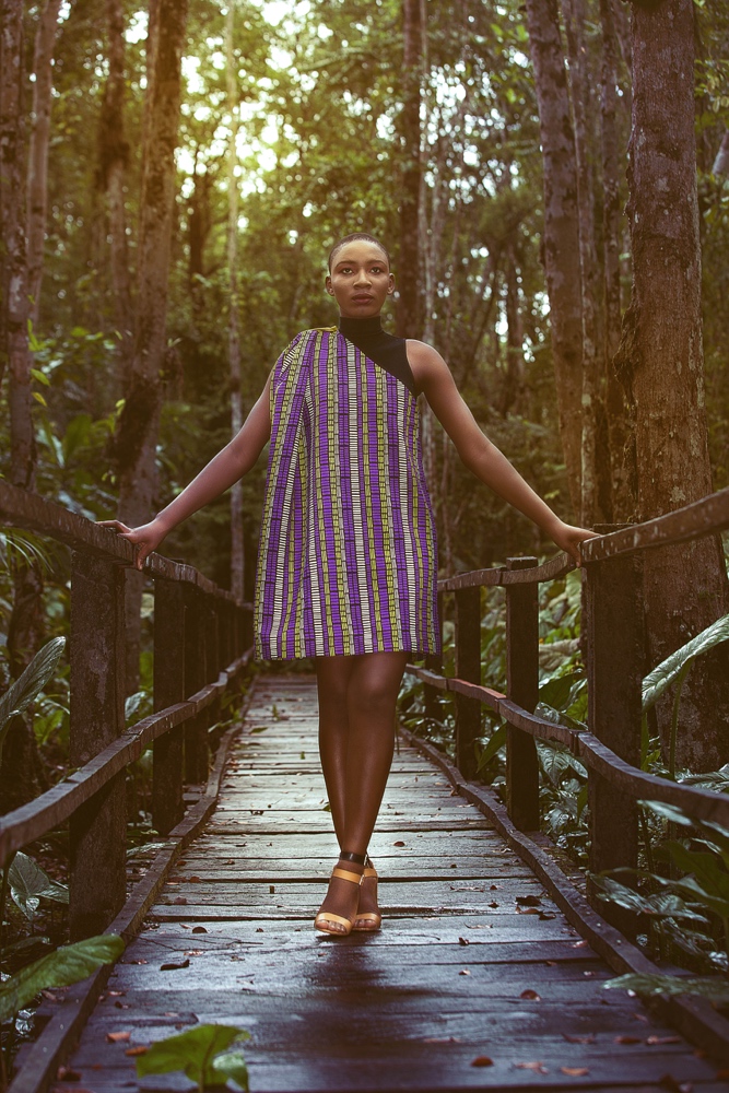
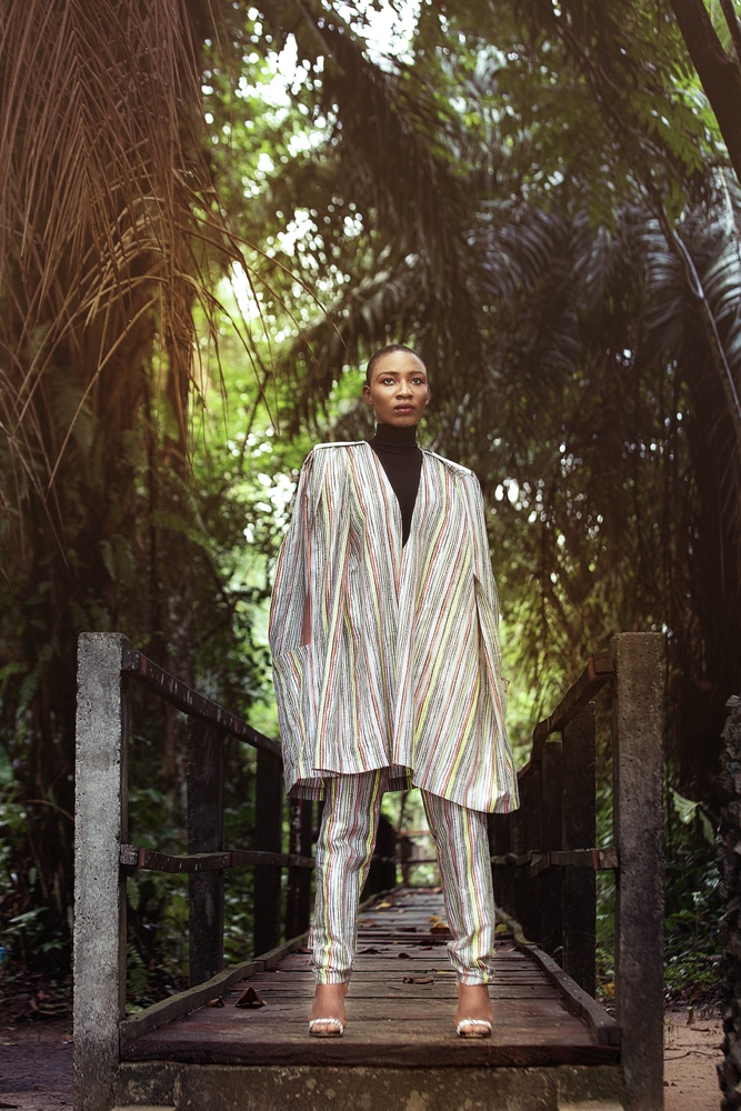
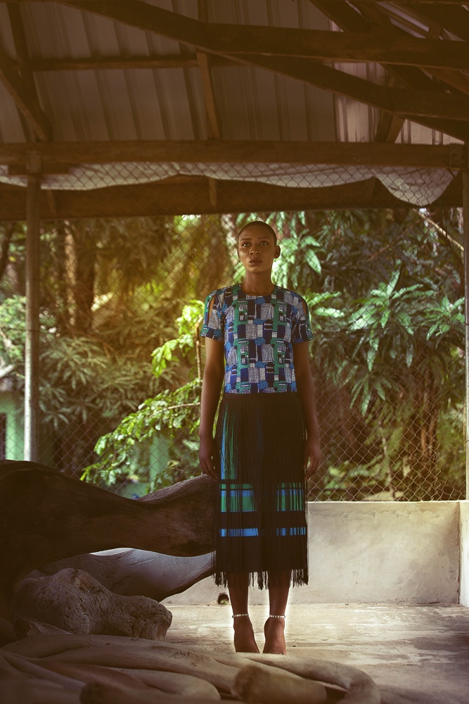
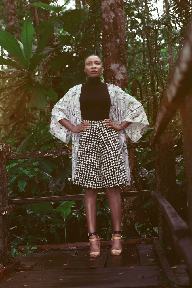
Richard: And not just the clothes, even the location used is ‘wild’ so a fragile looking face would have balanced it well
Eki: I guess there IS such a thing as too much edge. Oh ok I think I see your points
Richard: And the clothes, lol, I can’t
Eki: I like the idea of the clothes on some ladies who’ll rock it well, just not me. I’m not very edgy but I like the matching print set and the fringe skirt. Any faves for you?
Richard: I mean, I always ask for fashion forwardness, but this here I can’t explain. The black and white plaid culotte and kimono perhaps
Eki: Lol I thought you would say no faves because it’s not bad!
Richard: Lol. Trust me, it was a seek and find for me
Eki: ?ok
***
Here’s part one incase you missed it, click here.

